
There are number of ways in which you can use drag and drop to get content in and out of Indesign. Here are my favourites:
If you ever get a lot of content for a layout delivered to you in a folder full of images,logos, text files, etc., there's a fast and easy way to get the files into InDesign that will enable you to avoid placing them one by one.
Any file type that you can import into InDesign using the Place command can also be dragged and dropped into InDesign from the desktop.
What’s great about this feature is that you can drag and drop multiple files into
InDesign in a single step. You can drag and drop all the text and/or graphic files in a project folder into your InDesign layout in one step—and that could be a big time
saver if you’re looking at importing dozens of files.
When you drag and drop from the desktop, you’ll see the icons of the files you’re placing as your cursor moves into InDesign.
1.
Arrange your InDesign windows so that you can see the desktop folder from which you want to drag and drop the files.
2.
Select all the files you want to import,and then drag them into an InDesign document window. You’ll see ghosted versions of the icons. InDesign will cascade all the imported files when you release the mouse button, and it will use the position of your cursor as the starting point for the distribution of the placed files.
Here you see the files I dragged into my layout.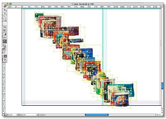
cool eh?
source:Adobe Tips, Tricks and Techniques - Adobe Indesign CS by Tim Cole

A simple pixel stretching suitable for blog header design and etc.
STEP 1
Open a graphic that you have selected.. choose a square one.. Here, I'm using Malaysian batik motif...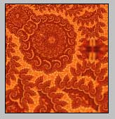
STEP 2
Now, change the canvas size to a rectangle shape.. Click on Image > Canvas Size and change the setting as below..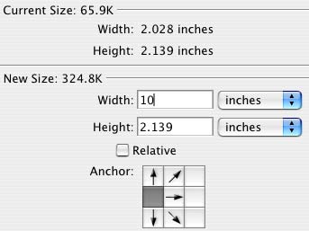
STEP 3
Then, select Single Column Marquee Tool..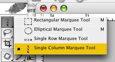
.. and make selection at as shown below
STEP 4
Press ctrl+C ( copy ) and ctrl+V ( paste ) and automatically a new layer will appear on the motif.
Then, press ctrl+T ( transform) and stretch the motif till to the end of the canvas.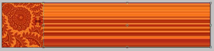
Click for larger image
LAST STEP
Add in your blog name or anything that you like.. Use your creativity by adding other elements of design..
or may be you can change the color using Hue & Saturation.. and there you go.. your own pixel stretching blog header.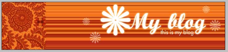
Click for larger image
download .psd here
Learn how to make an official stamp and position it on your website using CSS.
Simple and easy to understand
link:http://www.alexallied.com/tutorials
Today, we're going to learn the fast and easy technique of creating
cloud effect using Photoshop.
step 1
Open a new document. Select #1799D5 as background color.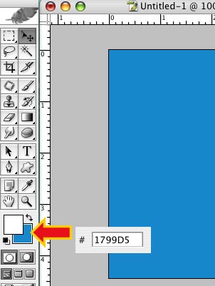
step2
Press 'Q'- shortcut for quick mask mode
Click on filter > render > difference cloud
Then, click ctrl+F ( PC ) or Command+F (mac ) for five times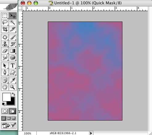
step 3
Press 'Q' again to exit quick mask mode. Automatically there will be
selection on the background.
make a new layer and name it cloud.. then, fill in white color
last step
duplicate cloud layer to add on more clouds
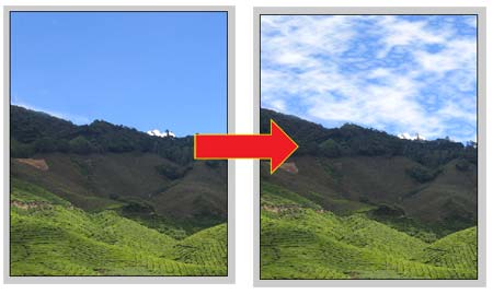
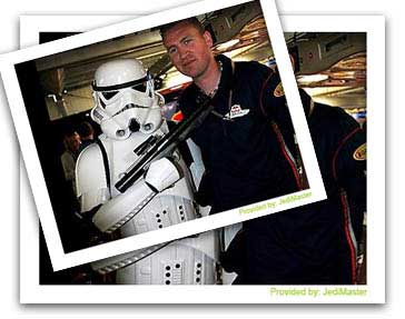
Photo border... Another creative creation using Photoshop
tutorial by: jedimaster
www.muzamli.com
1. THE FIRST STEP
Select an image or photo. I'm using the image above (Photo A) which size is 327 x 260 pixels. Open a new document (Photo B). Size: 364 x 287 pixels with resolution of 72dpi and in RGB color mode.
Then, select Photo A and drag the image to the new document using Move Tools (V)

You can see that I had leave some space around the image for the Photo Border.
2. STROKE EFFECT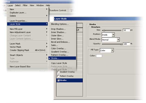
On Photoshop Menu Bar, select Layer > Layer Style > Blending Options > Stroke.
Use the setting below:
Structure:-
-Size : 10 pixels (make it thick)
-Position : Inside (Border will be construct inside the image area)
-Blend Mode : Normal
-Opacity : 100%
Fill Type: Color
-Color : White (or any other color)
3. Drop Shadow Effect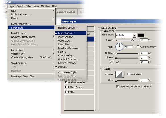
Again, on Photoshop Menu Bar, select Layer > Layer Style > Blending Options > Drop Shadow.
Use the setting below for Drop Shadow:
Structure:-
-Blend Mode : Multiply (Black)
-Opacity : 75%
-Angle : 90 degrees (uncheck Use Global Light first)
-Distance : 3px
-Spread : 0%
-Size : 10px
Quality;- Default setting
4. Background
If the Shadow effect is not visible enough, try to fill in color to the background. I'm using white as my background color.
(Note: Fill in color on the Background Layer! Not on the image layer). (See the result below)
5. Final Touch Up
You can use your own creativity to make it look more interesting. For example, make it looks like a pile of photos as shown above.
Simple isn't it. That's all for now. :-)

world cup 2006 vector logo in eps format. open in any vector graphics application - Illustrator, coreldraw,freehand etc.
download here
WC 2006 vector
click free download
looking for world cup team crests?
download here
team crests
click free download
World cup 2006 logo © 2001 - 2006 FIFA, All Rights Reserved
Looking for world cup team wallpaper?
England
download 1024x768
Netherlands
download 1024x768
Germany
download 1024x768
Brazil
download 1024x768
Spain
download 1024x768
more soon!
design by:huzeyk
World cup 2006 logo © 2001 - 2006 FIFA, All Rights Reserved


Choose a good color scheme..
Generator of color schemes and palettes to create good-looking and well balanced and harmonic web pages. This is the new version of the previous color generator.
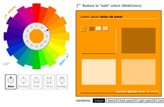
click here
http://wellstyled.com


