

Ok, so it's a stretch to include this tip anywhere, but i thought it was cool. Make yourself famous by appearing in the credits that display on a PC when you choose Help>About Illustrator and click on the Credits button. Just modify the file located in Adobe Illustrator CS2\Support Files\Content\Windows. The file name is CreditsText.utxt and it opens in any basic text editor.
Add your name into it, save it and show the credits. You can impress all of your friends by saying you were on the product team. (okay, maybe that's exxagerating a bit. They probably won't believe you, but it's still fun.)
---------
i've bought this book at MPH, Kuala Lumpur. Lots of new tips and techniques. love it!
From:Illustrator CS2 Killer tips by Dave Cross and Matt Kloskowski
www.peachpit.com

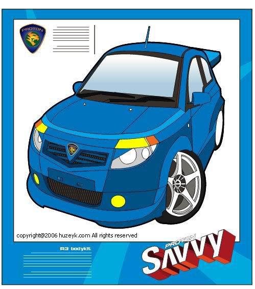
world cup 2006 is just around the corner
download this vector file for your non-commercial projects
download here


There are a few techniques to create aqua button. This is one of it.
Step 1:
Open a new document. Set the size at 200 pixels x 200 pixels.
Step 2:
Select Pencil Tool and make two lines as shown. Pencil size is 1 pixel. Color code: R=104 G=137 B=171.
Step 3:
click rectangular marquee tools ( shortcut M). Make selection between 2 lines. See picture
Step 4:
Select Gradient Tool. Drag Gradient Tool vertically from the top
Color code: R=201 G=218 B=236 Background color: White
Step 5:
Using Rectangular Marquee Tool, select an area as shown. Make sure it's not too big. Set the foreground color: R=201 G=218 B=236 and background color: R=201 G=218 B=236.
Step 6:
Select gradient Tool and drag it vertically from the top. Make sure the Gradient Editor is in Foreground to Transparent mode.
Step 7:
Zoom the document to 200%. Select Pencil tool and make a line. Line color code: R=201 G=218 B=236.
finish :).
Simple isn’t it? Thank you for following through this tutorial and have a great time using your new buttons!
This tutorial is for Adobe Illustrator CS users. I'll update it from time to time to share the techniques that I know.
step 1
Make a circle shape
Color code: R=237 G=107 B=17
step 2 
Make a shape as shown. One to be place on top and another one below the circle.
step 3 

step 4
Place these two shapes on the circle. Now, you've got yourself a glass effect button!

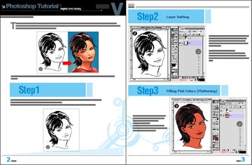
The steps of the tutorials below is for Adobe Photoshop 6. All the shortcuts is according to Macintosh keyboard (quite similar with PC). This tutorial is for those who are familiar with Photoshop. To render a face is a bit tricky, needs a little patient.
Click on images to enlarge

Direction: Download lineart step 1, then click & download actual size file. When coloring in Photoshop, display the files next to the other so it'll be easy for you to refer and pick colors.
1. Download Lineart
p/s - click image to enlarge
Download lineart DARIA without changing the size and dpi.
Open the file using Photoshop (Command+O). Make sure the file is in RGB mode.
2. Layer Setting
Set the layer as shown above. Rename Layer 1 as 'daria' and set it to MULTIPLY. Create a new transparent layer below Layer 1. Name it 'flat' and set it to NORMAL.
Making Lasso Selection
Make lasso selection on Layer 'flat'. Hold the 'Option' key to select different areas of the face, hair, eye pupils & lips.
3. Filling Flat Colors (Flattening)
On Layer 'flat', fill in flat color to the face, hair, eye pupils & lips.
Shortcut for 'Fill Color' is Option+Delete.
Select colors for the face, hair, eyes & lips from the actual image using Eyedropper Tool.
4. Airbrush Tool - Brush Setting
Select Airbrush Tool from the Toolbox and set the Brush Setting to:
Brush pressure - 30%
Brush diameter - 175%
Hardness - 0%
Spacing - 25%
5. Start Airbrushing
The green guide circle that I made shows the brush size. Using Magic Wand, select areas of the face. Pick 'Foreground Color' from the Toolbox. Spray on the forehead with 3 clicks (1), observe the brush position which is a little bit off from the selection. Then, spray in the middle of the face with 3 clicks (2). Done.
6. Forehead Shading
Make lasso selection on the forehead. Pick color from the Toolbox. Shade the lower part of the forehead according to the movement shown.
7. Shading the Eyes, Cheeks & Chin
Make lasso selection just like the above. Set the brush diameter to 80% (Shortcut: Press the ' [ ' key for a few times). Pick color from the Toolbox. Shade on the lasso selection area according to the above. Observe the brush position. Set brush diameter to 40% and shade the lower part of the nose with 2 clicks. Observe the brush position.
8. Airbrushing Cheeks & Chin Area
Make lasso selection just like the above. Set the brush diameter to 70%. Pick color from the Toolbox. Spray on the lasso selection area with 2 clicks. Observe the brush position. Set the brush diameter to 50% and spray the chin area with 2 clicks. Observe the brush position. Now, you can see the form of the face.
9. Airbrushing Right & Left Cheek
Make lasso selection on the right & left cheek. Set the brush diameter to 60%. Pick color from the Toolbox. Spray on the lasso selection area with 2 clicks. Observe the brush position.
10. Airbrushing Lips
Make lasso selection just like the above. Set the brush diameter to 30%. Pick color from the Toolbox. Spray on the lasso selection area with 2 clicks. Observe the brush position.
11. Airbrushing Hair
Select hair area using Magic Wand Tool. Set the brush diameter to 60%. Pick color from the Toolbox. Spray on the selection area with 3 clicks. Observe the brush position. Now, the form of the face is much better.
12. Airbrush Highlights

Make lasso selection on the area of the hair, nose & lips (and forehead if you want to). Set the brush diameter to 150% for the hair, 60% for the nose & 30% for lips. Spray on the hair according to the brush position. Observe the brush position.
13. Airbrush Extras
Make lasso selection just like the above. Set brush diameter to 100%. Spray with 2 clicks. Observe the brush position. Now, it's all done.

14. Final Touch up & 2 Light Sources
When everything is OK, you can decide to add on shading or play with o few light sources. Daria is rendered with 2 light sources. Just try a few times so you'll understand then steps.
The Masters
Names such as Brian Haberlin (founder) & Liquid! are the first few people who applied this technique. Other names that are synonym with this comic coloring style are Justin Ponsor, Guy Major, Matt Milla, Richard Isanove and Dave Kemp.
Samples

download complete digital comic coloring - pdf format (e-book)

download here
by ensalim-huzeyk team
salimdawam@yahoo.com
huzeyk portfolio gallery
http://www.huzeyk.com/
by Ray Smith
A corporate logo design should be highly instrumental in building your corporate identity and should successfully exude the company’s attitude. The viewers must have some idea about the disposition, character, or fundamental values of your company through your logo.
Following certain basic principles can ensure that your corporate logo design is professional easy to remember and creates a great impact on its viewers while successfully expressing the nature of your business.
Go for Professional Logo Designers You might save a few dollars doing your own logo or getting it done from the next door boy who knows the basics of designing but if you are serious about your business you should always go for a professional logo design firm. Your corporate logo is your identity, your customers recognize you by your logo, so the more professional and sophisticated your logo is the better will be your customer’s impression about your company.
Though most of the logo design companies charge exorbitant rates to create a corporate logo design but the industry is changing. These days there are companies that offer excellent professional logos for nominal charges (e.g., corporate logo design
Simplicity
Keep it Simple An ideal corporate logo design should be simple and memorable. Corporate houses spend thousands of dollars to ensure that customers remember them at all point of time and a simple logo is the key to that. Think about the Nike logo, it’s simple and memorable—once you see the Swoosh, do you ever need to think twice about the company name?
Colors
Colors you use for your corporate logo are a very important factor in your brand establishment. If you already have your corporate colors ask your logo designer to use those colors for the logo. If you don’t, suggest the colors that you think might give your prospective clients some idea about the type of business you do. For example, a company working in the fields of forest conservation might like their logo to be in green. At the same time, you also need to consider which colors will go well with your corporate stationeries as well.
Black and White version
While emphasizing the colors we must also remember that it is important for a corporate logo to come out well in black and white. A corporate logo design is used in all corporate communications including fax and photocopied document where they will be in black and white and the logo design must be such that it holds the same impact even in black and white.
Minimize Colors
This is more important from an economic and usability point of view. Corporate logos are often required to be printed for stationary and corporate literature. Using a one or two spot color logo can save a lot of cost compared to printing a full color logo.
Logo Format
It is advisable to always use a vector format for your corporate logo design. A corporate logo may be required to be reproduced at any size for different purposes in the future. A logo design done in vector format can be expanded to any size without any loss of image quality, where as a corporate logo in raster format will loose image quality, if scaled up. Also it is easier to convert a vector logo design to bitmap than vice versa.
If you get a professional logo design firm to do your corporate logo and brief them about this basic tips (most of the knowledgeable firms are well aware of these principles) you are sure to get a satisfactory corporate logo design that would go a long way in helping you establishing your brand.
Use your Logo:
Once you are ready with your corporate logo start giving it maximum exposure possible. Not only on your business cards and letterheads but also on your packaging, uniforms, pens and all possible goods should contain your logo. This gives wider exposure to your logo and people gets familiar with the corporate logo much faster. With all these you are on your way to establish your brand.
Ray Smith is a Marketing Expert with years of experience in different industries and specialised knowledge in internet marketing.He has come up with the new pricing concept of "your logo, your price", which is successfully implemented by the website. http://www.mycorporatelogo.com http://www.mycorporateidentity.com
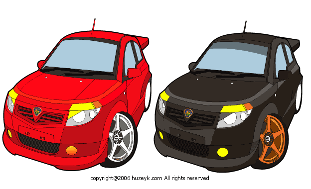
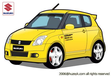
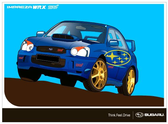
i love to vectorized car..
this artwork is fully created with adobe illustrator cs
and take around 3-4 hours to completed...
enjoy..:-)

It's not good enough for graphic designers to say "I chose the color purple because it looks good with __________". Or because the color is cool, trendy, etc. When you design, you should have reasons for the colors you choose. If you don't, how are you going to sell your customer on the fact that the color you chose has the appropriate color meaning for his project?
Below are just some of the meanings associated with color:
Blue
-Sky
-Sea
-Water
-Religious feeling
-Peace
-Faith
-Stability
-Melancholy
-Trust
-Loyalty
-Wisdom
-Tranquility
-Integrity
Red
-Fire
-Love
-Passion
-Energy
-Revolution
-Anger
-Power
-Debt
-Danger
-Heat
-Warning
Green
-Money
-Growth
-Environmentally friendly
-Fertility
-Envy
-Spring
-Freshness
-Stability
-Loyal
-Healing
-Yellow
-Energy
-Sun
-Happiness
-Cheery
-Creativity
Orange
-Joy
-Sunshine
-Creativity
-Determination
-Success
-Encouragement
-Energy
-Autumn
-Construction
Purple
-Royalty
-Power
-Nobility
-Luxury
-Spirituality
Brown
-Conservative
-Stable
-Outdoors
-Fall
-Earth
-Organic
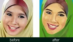
Hi, now I wanna share a technique of tracing in Adobe Photoshop. I would like stress on concentracing more on about lighting and shadow. If you understand these two concepts properly, undoubtly you will face no problem to start on tracing technique.
steps
1. First, get a photo and scan it by a big resolution, about 300-600dpi. For this picture, I use 600dpi. Save it in *.jpg format.
2. Open Adobe Photoshop(I am using version 7.0) and be ready to use common tools like Lasso, Eyedropper, and Brush. Set the Brush tool at normal mode with opacity 25%-45%. Use high resolution for the best quality, because this technique is a pixel-based art, unlike vector-based art like in Illustrator, Freehand, CorelDraw,etc. (I am using 150-300dpi). Save the file in *.psd mode.
3. To begin, start at the face part. Select the face using lasso tool, as shown in the pic below.. Don't forget to create a layer and name it as 'muka', which means face.
4. Select the most basic skin color using the eyedropper,after the most suitable color is selected, click Fill>Foreground Color, and the output is as shown below.
5. Hide the 'muka' layer. at Background layer, select the shadow part of the face(see pix).
tips: to create multiple lasso selection, press shift as you are selecting
6. Fill the selected part(shadow part) with a darker color. (a bit darker than the basic skin color). soft-click your mouse to produce light brush effect, and lighter color.(see pix).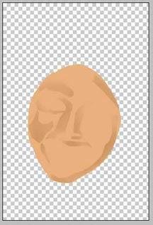
7. Hide again the 'muka' layer and choose the the light part of the face using lasso tool. Pick a lighter color than the basic skin color to create a lighting effect. Color softly to create a light brush effect(see pix)
8. Repeat step 5 to color mouth part, choose suitable color.
9. Select the dark part of the mouth and color it with darker color than the basic lip color.
10. Repeat step 7 to create lighting effect for the mouth.
11. to produce better effect, use as many layers as you can, so that each mistake can be corrected easily. For eyes part, repeat step 5 and color it by using basic eye color.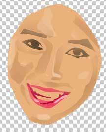
12. After repeating the steps(lighting and shadowing), the latest output can be seen in the pix below. For more interesting effect, try not too rigid in following the actual photo's color. this is because it will limit your quality and freedom of art. Try your best to choose your own logic color. Example of face color: brown, Lip: red, etc
13. Start to color the veil by creating a layer named 'tudung'. Repeat the steps in coloring the face. make sure the 'tudung' layer is under the 'muka' layer.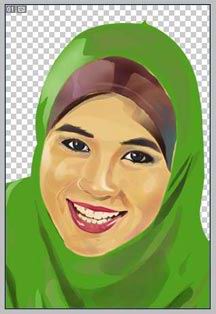
14. Finally, create a last layer named 'latar' for the background color. Choose your own desired color, either gradient or flat color.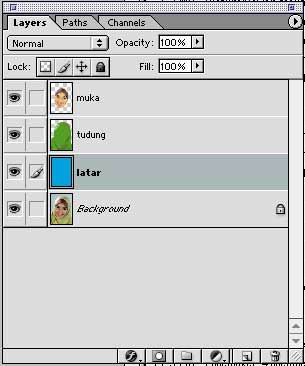

sample artworks
link 1
link 2
tutorial by : me http://huzeyk.blogspot.com
for more lasso artworks:http://www.huzeyk.com/portfolio.html
special thanks to-hairi-http://wanzu.net
translated by : wintersoltish
Related tutorial:
digital comic coloring - marvel style
easy way to color your comic in Illustrator